Demo
Favorites
...
Messages
...
Settings
...
This component can be manipulated with Tab, Left Arrow, Right Arrow, and Enter On your keyboard.
How to:
HTML, CSS, and Javascript
The following code samples are implemented on this site using Laravel Blade, Tailwind, Daisy UI, and Font Awesome.
Let's start with assembling Blade components to handle the tabbed panes UI:
We will need 3 components. An outer wrapper to hold the tabs and panes, a tab, and a pane.
The outer wrapper:
Blade
@props(['id', 'activeTabID', 'activePaneID', 'focusAt', 'tabListLabel', 'tabsWrapperClass', 'panesWrapperClass'])

@php

$tabsClassList = (!empty($tabsWrapperClass)) ? 'tabs ' . $tabsWrapperClass : 'tabs';
$panesClassList = (!empty($panesWrapperClass)) ? 'panes ' . $panesWrapperClass : 'panes';

@endphp

{{------------------}}
{{-- tabbed panes --}}
<div id="tabbedPanes_{{ $id }}" class="tabbedPanesWrapper" data-active-tab="{{ $activeTabID }}" data-active-pane="{{ $activePaneID }}">

    {{----------}}
    {{-- tabs --}}
    <div id="tablist_{{ $id }}" class="{{ $tabsClassList }}" role="tablist" data-focus-at="{{ $focusAt }}" aria-label="{{ $tabListLabel }}">
        {{ $tabs }}
    </div>
    {{-- end tabs --}}
    {{--------------}}

    {{-----------}}
    {{-- panes --}}
    <div id="panelist_{{ $id }}" class="{{ $panesClassList }}">
        {{ $panes }}
    </div>
    {{-- end panes --}}
    {{---------------}}

</div>
{{-- end tabbed panes --}}
{{----------------------}}A tab:
Blade
@props(['id', 'active', 'active', 'controls'])
@php

$selected = $active;
$tabIndex = ($active == 'true') ? 0 : -1;

$defaultClassList = 'tab';

@endphp

{{-- tab --}}
<button id="{{ $id }}" {{ $attributes->merge(['class' => $defaultClassList]) }} role="tab" aria-selected="{{ $selected }}" aria-controls="{{ $controls }}" tabindex="{{ $tabIndex }}">
    {{ $slot }}
</button>A pane:
Blade
@props(['id', 'class', 'active', 'labelledBy'])

@php

// default css for inactive and active panes
$defaultClassList = 'pane fade';
$inactiveClassList = ' faded-out';
$activeClassList = ' pane-active faded-in';

// additional css passed into component
if (!empty($class)) { $additionalClasses = ' '.$class; } else { $additionalClasses = ''; }

// build class list based on active state and additional classes
$conditionalClassList = ($active == 'true') ? $activeClassList . $additionalClasses : $inactiveClassList . $additionalClasses;

// get class list
$classList = $defaultClassList . $conditionalClassList;

@endphp

{{-- pane --}}
@if($active == 'false')
    <div id="{{ $id }}" class="{{ $classList }}" role="tabpanel" tabindex="0" aria-labelledby="{{ $labelledBy }}" hidden>
@else
    <div id="{{ $id }}" class="{{ $classList }}" role="tabpanel" tabindex="0" aria-labelledby="{{ $labelledBy }}">
@endif
    {{ $slot }}
</div>These components use some custom classes which we can register in our app.css
CSS
@tailwind base;
@tailwind components;
@tailwind utilities;

@layer components
{
    .tab-active { @apply text-primary; }
    .tab-bordered.tab-active:not(.tab-disabled):not([disabled]) { @apply border-primary; }

    .pane { @apply hidden; }
    .pane-active { @apply block; }

    .fade { @apply transition-opacity duration-300; }
    .faded-in { @apply opacity-100; }
    .faded-out { @apply opacity-0; }
}Then we can go about using our components in Blade files.
Blade
{{------------------}}
{{-- tabbed panes --}}
<x-default.tabbedPanes
    id="group1" activeTabID="tab_1" activePaneID="pane_1"
    focusAt="0" tabListLabel="Group 1 Tabs"
    tabsWrapperClass="mb-6" panesWrapperClass=""
>

    {{-------------}}
    {{-- tablist --}}
    <x-slot:tabs>

        {{----------}}
        {{-- tabs --}}

        {{-- tab --}}
        <x-default.tabbedPanes.tab id="tab_1" class="tab-bordered tab-active" active="true" controls="pane_1">
            <i class="fa-solid fa-eye"></i>
            Tab 1
        </x-default.tabbedPanes.tab>

        {{-- tab --}}
        <x-default.tabbedPanes.tab id="tab_2" class="tab-bordered" active="false" controls="pane_2">
            <i class="fa-solid fa-eye"></i>
            Tab 2
        </x-default.tabbedPanes.tab>

        {{-- tab --}}
        <x-default.tabbedPanes.tab id="tab_3" class="tab-bordered" active="false" controls="pane_3">
            <i class="fa-solid fa-eye"></i>
            Tab 3
        </x-default.tabbedPanes.tab>

        {{-- end tabs --}}
        {{--------------}}

    </x-slot:tabs>
    {{-- end tablist --}}
    {{-----------------}}

    {{-----------}}
    {{-- panes --}}
    <x-slot:panes>

        {{-- pane --}}
        <x-default.tabbedPanes.pane id="pane_1" class="" active="true" labelledBy="tab_1">
            <p>Pane 1 content</p>
        </x-default.tabbedPanes.pane>

        {{-- pane --}}
        <x-default.tabbedPanes.pane id="pane_2" class="" active="false" labelledBy="tab_2">
            <p>Pane 2 content</p>
        </x-default.tabbedPanes.pane>

        {{-- pane --}}
        <x-default.tabbedPanes.pane id="pane_3" class="" active="false" labelledBy="tab_3">
            <p>Pane 3 content</p>
        </x-default.tabbedPanes.pane>

    </x-slot:panes>
    {{-- end panes --}}
    {{---------------}}

</x-default.tabbedPanes>
{{-- end tabbed panes --}}
{{----------------------}}Get a copy of TabbedPanesHandler.js
Javascript
class TabbedPanesHandler
{
    /**
     * Creates a new TabbedPanesHandler instance.
     *
     * @param {Number} fadeDuration Milliseconds for the fade animation to happen. Default 300.
     * @param {Number} fadeInDelay Delay for fade in after a pane's display changes from hidden to block.
     *
     * @return {undefined}
     */
    constructor(fadeDuration = 300, fadeInDelay= 100)
    {
        this.fadeDuration = fadeDuration;
        this.fadeInDelay = fadeInDelay;

        // get each tablist component on the page and assign arrow key event listener
        this.tablists = document.querySelectorAll('.tabbedPanesWrapper > .tabs');
        this.handleArrowKeysForEachTablist();

        // get each tab and assign click event listener
        this.tabs = document.querySelectorAll('.tabbedPanesWrapper > .tabs > .tab');
        this.handleEachTab();
    }
    // end constructor()


    /**
     * Assign right and left arrow keydown events to each tablist.
     *
     * @return {undefined}
     */
    handleArrowKeysForEachTablist()
    {
        this.tablists.forEach((tablist) =>
        {
            // get the current tablist's tab-focus data attribute
            let tabFocus = tablist.dataset.focusAt;

            // get the current tablist's tabs
            const tabs = tablist.querySelectorAll('.tab');

            // add event listener for right and left arrow keys
            tablist.addEventListener('keydown', (ev) =>
            {
                if (ev.key === 'ArrowRight' || ev.key === 'ArrowLeft')
                {
                    // disable tabindex for the currently active tab
                    tabs[tabFocus].setAttribute("tabindex", -1);

                    // move right, increment tab focus, if we're at the end, go to the start
                    if (ev.key === "ArrowRight")
                    {
                        tabFocus++;
                        if (tabFocus >= tabs.length) { tabFocus = 0; }
                    }

                    // move left. decrement tab focus, if we're at the start, move to the end
                    else if (ev.key === "ArrowLeft")
                    {
                        tabFocus--;
                        if (tabFocus < 0) { tabFocus = tabs.length - 1; }
                    }

                    // enable tabindex and set focus for tab we are moving to
                    tabs[tabFocus].setAttribute("tabindex", 0);
                    tabs[tabFocus].focus();
                }
            })

        });
    }
    // end handleArrowKeysForEachTablist()


    /**
     * Assign click event listener to each tab.
     *
     * @return {undefined}
     */
    handleEachTab()
    {
        this.tabs.forEach((tab) =>
        {
            tab.addEventListener('click', () =>
            {
                // get currently active tab and pane element ids
                const activeEls = this.getActiveElementsFromTabOuterWrapperData(tab);

                // if clicking on a tab that is not currently active
                if (tab.id !== activeEls.active.tab.id)
                {
                    // swap active elements for target elements
                    this.swapTabsAndPanes(this.getEventElements(activeEls, tab));
                }

            })
        })
    }
    // end handleEachTab()


    /**
     * Builds an object to store the (active tab and pane), the (target tab and pane), and the tabs outer wrapper.
     *
     * @param {Object} activeEls Derived from dataset of the tab's tablist's parent element.
     * @param {HTMLElement} tab The tab that was clicked on.
     *
     * @return {Object}
     */
    getEventElements(activeEls, tab)
    {
        // get target pane element by id
        const targetPaneID = tab.getAttribute("aria-controls");
        const targetPane = document.getElementById(targetPaneID);

        // return the (active tab and pane) elements, the (target tab and pane) elements,
        // and the tab's outer wrapper grouped into an object
        return {
            ...activeEls,
            'target': {'tab': tab, 'pane': targetPane},
            'outerWrapper': this.getTabOuterWrapper(tab)
        };
    }
    // end getEventElements()


    /**
     * Finds active tab and pane elements by id from the tab's outer wrapper's dataset.
     *
     * @param {HTMLElement} tab The tab that was clicked on.
     *
     * @return {Object} {active: {tab: HTMLElement, pane: HTMLElement}}
     */
    getActiveElementsFromTabOuterWrapperData(tab)
    {
        const tabWrapper = this.getTabOuterWrapper(tab)
        const activeTab = document.getElementById(tabWrapper.dataset.activeTab);
        const activePane = document.getElementById(tabWrapper.dataset.activePane);

        return { 'active': {'tab': activeTab, 'pane': activePane} };
    }
    // end getActiveElementsFromTabOuterWrapperData()


    /**
     * Gets the top level container of a tab. E.g. 'div.tabbedPanesWrapper'.
     *
     * @param tab The tab that was clicked on.
     *
     * @return HTMLElement That tab's tablist's parent node.
     */
    getTabOuterWrapper(tab)
    {
        const tablist = tab.parentNode;
        return tablist.parentNode;
    }
    // end getTabOuterWrapper()


    /**
     * Deactivate the currently active tab and pane, then activate the target tab and pane
     *
     * @param {Object} eventElements The (active tab and pane) and (target tab and pane), and their top level container.
     *
     * @return {undefined}
     */
    swapTabsAndPanes(eventElements)
    {
        // swap tabs
        this.deactivateTab(eventElements.active.tab);
        this.activateTab(eventElements.target.tab, eventElements.outerWrapper);

        // swap panes
        this.deactivatePane(eventElements.active.pane);
        this.sleep(this.fadeDuration).then(() =>
        {
            this.activatePane(eventElements.target.pane, eventElements.outerWrapper);
        });
    }
    // end swapTabsAndPanes()


    /**
     * Deactivates a tab.
     *
     * @param {HTMLElement} tab The currently active tab.
     *
     * @return {undefined}
     */
    deactivateTab(tab)
    {
        tab.setAttribute("aria-selected", false);
        tab.classList.remove('tab-active');
    }
    // end deactivateTab()


    /**
     * Deactivates a pane.
     *
     * @param {HTMLElement} pane The currently active pane to be hidden.
     *
     * @return {undefined}
     */
    deactivatePane(pane)
    {
        pane.classList.replace('faded-in', 'faded-out');
        this.sleep(this.fadeDuration).then(() =>
        {
            pane.classList.remove('pane-active');
            pane.hidden = true;
        });
    }
    // end deactivatePane()


    /**
     * Activates a tab.
     *
     * @param {HTMLElement} tab The tab that was clicked on.
     * @param {HTMLElement} outerWrapper The tab's top level container.
     *
     * @return {undefined}
     */
    activateTab(tab, outerWrapper)
    {
        this.updateOuterWrapperDataAttribute(outerWrapper, 'activeTab', tab.id);
        tab.setAttribute("aria-selected", true);
        tab.classList.add('tab-active');
    }
    // end activateTab()


    /**
     * Activates a pane.
     *
     * @param {HTMLElement} pane The pane to be shown.
     * @param {HTMLElement} outerWrapper The pane's top level container.
     *
     * @return {undefined}
     */
    activatePane(pane, outerWrapper)
    {
        this.updateOuterWrapperDataAttribute(outerWrapper, 'activePane', pane.id);
        pane.classList.add('pane-active');
        pane.hidden = false;
        setTimeout(() => { pane.classList.replace('faded-out', 'faded-in'); }, this.fadeInDelay);
    }
    // end activatePane()


    /**
     * Updates a dataset attribute of a tabbedPanes component top level container. E.g. the 'activeTab' or 'activePane'
     * of a 'div.tabbedPanesWrapper'.
     *
     * @param {HTMLElement} outerWrapper A tabbedPanes component top level container.
     * @param {String} attribute Which attribute to update.
     * @param {String} value The HTMl element id of the tab or pane that will be activated.
     *
     * @return {undefined}
     */
    updateOuterWrapperDataAttribute(outerWrapper, attribute, value)
    {
        outerWrapper.dataset[attribute] = value;
    }
    // end updateOuterWrapperDataAttribute()

    /**
     * Gets a new Promise that contains a setTimeout.
     *
     * @param {Number} time Milliseconds to sleep for.
     *
     * @return {Promise<unknown>}
     */
    sleep(time)
    {
        return new Promise(resolve => { setTimeout(resolve, time) });
    }
    // end sleep()

}
// end class TabbedPanesHandlerWhen the page loads we create a new instance of that class:
Javascript
<script src="path/to/TabbedPanesHandler.js"></script>
<script>

    window.addEventListener('DOMContentLoaded', () =>
    {
        const TPH = new TabbedPanesHandler();
    });

</script>Project Galleries
Tool
Color Average
Blend two colors to get their linear and logarithmic mid-point.
Tool
Multi Tab Opener
Like bookmarks on steroids: time released links with options and storage.
App
Jitter Bug
Simulated page traffic and product sales for marketing.
App
Shopping Cart
Originally made for use on Unbounce with Checkout Champ.
Tool
Public Library
A nifty little reading lens for classic novels using the Spritz SDK.
Collapse & Reveal
Animated Component
Slide a content block's height up or down.
Move Elements
Animated Component
Change or restore the location of a content block.
Code Snippet
Animated Component
The source code for this website's custom code snippet component.
Tabbed Panes
Animated Component
Nav tabs with content panels that fade in and out.
Window Resize Observer
Utility
Manage and perform a list of actions when the browser is resized.
Console Formatter
Utility
Opinionated extensions for console messages.
Fuzzy Scroll
Utility
Improved scroll-to behavior.
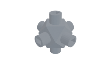
Cube Node
Have fun building structures by joining nodes with chopsticks
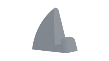
Laptop Stand
Use 2 to hold a thin laptop upright. Great with a wireless keyboard
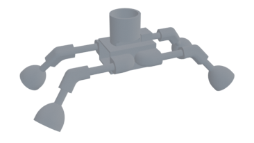
Little Buggy
A toy for kids. Requires 9V battery, small gray motor, and bouncy balls for feet
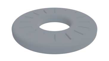
MicroSD Card Ring
Holds 16 MicroSD cards. Doubles as a paper weight