Demo
EXAMPLE CONTENT BLOCK
Lorem ipsum dolor sit amet, consectetur adipisicing elit. Aperiam deserunt dolore ex harum inventore labore laudantium officia, perspiciatis porro quaerat rem reprehenderit suscipit veritatis. Architecto aspernatur at maxime quae velit? Ad autem, blanditiis consectetur consequuntur dignissimos et facere nulla praesentium quae, quibusdam quisquam totam. Adipisci, aut doloremque error excepturi facilis iusto, nihil nisi officiis quaerat, quis reiciendis tempora! Quis, suscipit. Accusantium amet atque consectetur distinctio doloremque dolorum eligendi eum facilis fugit impedit in modi mollitia nemo nostrum obcaecati quas repellendus rerum velit, voluptatem voluptatibus? Ab error non porro quos reprehenderit? Ab accusamus ad cum eligendi minima nam optio quia veniam. Asperiores at consectetur dolorem, exercitationem in iusto magnam molestiae nam nihil praesentium quo rem repudiandae sequi tempore vel vero voluptate? Aliquam aliquid, assumenda beatae consequatur cum ducimus hic illum impedit inventore, ipsam provident qui quia quibusdam sed suscipit voluptate voluptatibus?
How to:
HTML, CSS, and Javascript
The following code samples are implemented on this site using Laravel Blade, Tailwind, Daisy UI, and Font Awesome.
Let's start with a container for our content:
- We need:
- A button with an id to trigger the animation
- A hidden checkbox with an id
- A container with an id
- Content with height that is less than the
max-heightof the container
HTML
<!-- button: toggle slide -->
<button id="btn-slideDemo" class="btn btn-primary" onclick="slideDemo.toggleSlide()">
    <i id="icon-slideDemo" class="fa-solid fa-angles-up transition-transform duration-300"></i>
    Toggle
</button>


<!-- checkbox for slide toggle -->
<input type="checkbox" id="checkbox-slideDemo" class="hidden" checked>


<!-- example container -->
<div id="container-slideDemo" class="fade faded-in transition-all duration-1000 scale-y-100 max-h-[500px]">

    <!-- content -->
    <p class="mb-6">EXAMPLE CONTENT BLOCK</p>
    <p>Lorem ipsum dolor sit amet, consectetur adipisicing elit...</p>

</div>
<!-- end example container -->Make sure you have the CSS classes for fading:
Almost all of the CSS classes above come from Tailwind. I use fade animations often so I have created my own classes for that in my app.css:
app.css
@tailwind base;
@tailwind components;
@tailwind utilities;

@layer components
{
    /* classes for fading */
    .fade { @apply transition-opacity duration-300; }
    .faded-in { @apply opacity-100; }
    .faded-out { @apply opacity-0; }
}In this example the fade class is being overridden so it's irrelevant. The faded-in and faded-out classes are being used by my JS class. If you want to use Tailwind, but not make edits to your app.css file, then you'll have to make edits to the HTML and JS.
Get the slide.js class:
slide.js
class Slide
{
    /**
     * toggle a content container (sled) & checkbox based on checked state.
     * handles up/down animation times as a whole or in steps.
     * handles sled height by css max-h class name
     *
     * @param {string} checkID checkbox for toggling
     * @param {string} slideID the content container to be toggled
     * @param {string} animationType "scale", "fade", or "both"
     * @param {number} durationUp milliseconds for slide up animation
     * @param {boolean} staggerUp if display/height animation are out of sync
     * @param {number} durationDown milliseconds for slide down animation
     * @param {boolean} staggerDown if height/display animation are out of sync
     * @param {string} heightClass css for sled max height
     * @param {string} iconID the icon to be toggled after sliding
     * @param {number} iconDelayUp milliseconds offset for icon animation
     * @param {number} iconDelayDown milliseconds offset for icon animation
     */
    constructor(checkID, slideID, animationType, durationUp, staggerUp, durationDown, staggerDown, heightClass, iconID, iconDelayUp, iconDelayDown)
    {
        this.check = document.getElementById(checkID);
        this.sled = document.getElementById(slideID);
        this.animationType = animationType;
        this.durationUp = durationUp;
        this.staggerUp = staggerUp;
        this.durationDown = durationDown;
        this.staggerDown = staggerDown;
        this.heightClass = heightClass;
        this.icon = document.getElementById(iconID);
        this.iconDelayUp = iconDelayUp;
        this.iconDelayDown = iconDelayDown;
    }


    /**
     * determine status of checkbox
     *
     * @return {boolean}
     */
    isChecked() { return this.check.checked; }


    /**
     * toggle status of checkbox
     *
     * @return undefined
     */
    toggleCheck() { this.check.checked = !this.isChecked(); }


    /**
     * perform swapping of css display classes for sliding up
     *
     * @return undefined
     */
    slideUpAnimation()
    {
        if (this.animationType === 'scale') { this.sled.classList.replace('scale-y-100', 'scale-y-0'); }
        else if (this.animationType === 'fade') { this.sled.classList.replace('faded-in', 'faded-out'); }
        else if (this.animationType === 'both')
        {
            this.sled.classList.replace('scale-y-100', 'scale-y-0');
            this.sled.classList.replace('faded-in', 'faded-out');
        }
    }
    // end slideUpAnimation()


    /**
     * handle display and height animations for slide up
     *
     * @param {number} duration time for slide animation
     *
     * @return undefined
     */
    slideUp(duration)
    {
        // -----------------------------
        // handle sled display animation
        this.slideUpAnimation();

        // ----------------------------
        // handle sled height animation
        // or wait for animationType then handle animation
        if (!this.staggerUp) { this.sled.classList.replace(this.heightClass, 'max-h-0'); }
        else { setTimeout(() => { this.sled.classList.replace(this.heightClass, 'max-h-0'); }, duration); }
    }
    // end slideUp()


    /**
     * perform swapping of css display classes for sliding down
     *
     * @return undefined
     */
    slideDownAnimation()
    {
        if (this.animationType === 'scale') { this.sled.classList.replace('scale-y-0', 'scale-y-100'); }
        else if (this.animationType === 'fade') { this.sled.classList.replace('faded-out', 'faded-in'); }
        else if (this.animationType === 'both')
        {
            this.sled.classList.replace('scale-y-0', 'scale-y-100');
            this.sled.classList.replace('faded-out', 'faded-in');
        }
    }
    // end slideDownAnimation()


    /**
     * handle height and display animations for sliding down
     *
     * @param {number} duration time for slide animation
     *
     * @return undefined
     */
    slideDown(duration)
    {
        // ----------------------------
        // handle sled height animation
        this.sled.classList.replace('max-h-0', this.heightClass);

        // -----------------------------
        // handle sled display animation
        // or wait for height animation then handle animation
        if (!this.staggerDown) { this.slideDownAnimation(); }
        else { setTimeout(() => { this.slideDownAnimation(); }, duration); }

    }
    // end slideDown()


    /**
     * handle slide animations
     *
     * @return undefined
     */
    toggleSlide()
    {
        // if sled contents are showing
        if (this.isChecked())
        {
            // slide them up then toggle check and button icon
            this.slideUp(this.durationUp);
            this.toggleCheck();
            setTimeout(() => { this.icon.classList.toggle('rotate-180'); }, this.iconDelayUp);
        }

        // else sled contents are not showing
        else
        {
            // slide them down then toggle check and button icon
            this.slideDown(this.durationDown);
            this.toggleCheck();
            setTimeout(() => { this.icon.classList.toggle('rotate-180'); }, this.iconDelayDown);
        }

    }
    // end toggleSlide()

}Then initialize a content slider:
In this example toggling the container's height/display and the corresponding button's icon animations will take 1 second without stagger.
Javascript
<script src="{{ asset('js/slide.js') }}"></script>
<script>
    const slideDemo = new Slide('checkbox-slideDemo', 'container-slideDemo', 'scale', 1000, false, 1000, false, 'max-h-[500px]', 'icon-slideDemo', 1000, 1000);
</script>The first three demos on this page have the same set-up, except that instead of "scale", I am using "fade", or "both". To use stagger on the collapse and/or reveal, change both/either of the "false" arguments to "true". If we stagger both and keep those animations at 1 second, then we just doubled the amount of time we need to wait for the icon animation delay. The last two arguments would need to be changed from "1000" to "2000".
Project Galleries
Tool
Color Average
Blend two colors to get their linear and logarithmic mid-point.
Tool
Multi Tab Opener
Like bookmarks on steroids: time released links with options and storage.
App
Jitter Bug
Simulated page traffic and product sales for marketing.
App
Shopping Cart
Originally made for use on Unbounce with Checkout Champ.
Tool
Public Library
A nifty little reading lens for classic novels using the Spritz SDK.
Collapse & Reveal
Animated Component
Slide a content block's height up or down.
Move Elements
Animated Component
Change or restore the location of a content block.
Code Snippet
Animated Component
The source code for this website's custom code snippet component.
Tabbed Panes
Animated Component
Nav tabs with content panels that fade in and out.
Window Resize Observer
Utility
Manage and perform a list of actions when the browser is resized.
Console Formatter
Utility
Opinionated extensions for console messages.
Fuzzy Scroll
Utility
Improved scroll-to behavior.
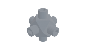
Cube Node
Have fun building structures by joining nodes with chopsticks
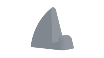
Laptop Stand
Use 2 to hold a thin laptop upright. Great with a wireless keyboard
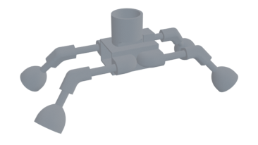
Little Buggy
A toy for kids. Requires 9V battery, small gray motor, and bouncy balls for feet
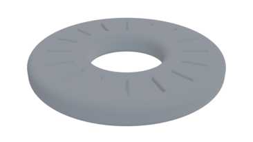
MicroSD Card Ring
Holds 16 MicroSD cards. Doubles as a paper weight