Demo:
A code snippet
Text
Lorem ipsum dolor sit amet, consectetur adipisicing elit...How to:
HTML, CSS, and Javascript
The following code samples are implemented on this site using Laravel Blade, Tailwind, Daisy UI, Highlight.js, and Font Awesome.
Let's start with a Blade component for displaying the code snippet UI:
Blade
@props(['id', 'title', 'maxH' => '50', 'extraCSS' => '', 'extraStyles' => ''])

{{-- code snippet container --}}
<div class="my-6">

    {{-- title bar and action buttons --}}
    <div class="relative flex justify-between bg-base-60 rounded-2xl pl-9">

        {{-- title --}}
        <div><p class="text-base font-bold -ml-6 sm:ml-0">{{ $title }}</p></div>

        {{-- action buttons --}}
        <div class="absolute right-0 join">

            {{-- button: modal --}}
            <button class="join-item btn btn-sm border-0 bg-base-60 hover:bg-base-80 text-base-content rounded-t-none"
                    onclick="codeSnippetModal_{{ $id }}.showModal()">
                Expand
            </button>
            {{-- button: modal --}}


            {{-- button: height --}}
            <div id="containerFor_input_maxHeight_{{ $id }}" class="join-item dropdown dropdown-end hidden">
                <label for="input_maxHeight_{{ $id }}" tabindex="0" class="btn btn-sm border-0 bg-base-60 hover:bg-base-80 rounded-none">
                    Height
                </label>
                <div tabindex="0" class="dropdown-content z-[1] menu p-2 shadow bg-base-60 rounded-box mt-4">

                    {{-- input[range]: snippet max height (wrapped in tooltip) --}}
                    <div class="tooltip tooltip-left" data-tip="{{ $maxH.'% of viewport' }}">
                        <input type="range" name="maxHeight_{{ $id }}" id="input_maxHeight_{{ $id }}" data-code-snippet="{{ $id }}"
                               value="{{ $maxH }}" min="0" max="100"
                               style="writing-mode: vertical-lr; transform: rotate(180deg)">
                    </div>
                    {{-- end input[range]: snippet max height (wrapped in tooltip) --}}

                </div>
            </div>
            {{-- end button: height --}}

            {{-- button: copy --}}
            <button id="btn_copyCodeSnippet_{{ $id }}" data-code-snippet="{{ $id }}"
                    class="join-item btn btn-sm btn-success border-0 bg-base-60 hover:bg-base-80 text-base-content
                           transition duration-300"
            >
                Copy
            </button>
            {{-- end button: copy --}}

        </div>
        {{-- end action buttons --}}

    </div>
    {{-- end title bar and action buttons --}}

    {{-- code snippet --}}
    <div class="bg-base-100 p-6 mx-3 rounded-b-2xl border-4 border-t-0 border-base-60">
        <div id="{{ $id }}"
             style="max-height: {{ $maxH.'vh' }}; transition: max-height 0.5s ease-out; {{ $extraStyles }}"
             class="codeSnippet whitespace-pre overflow-auto font-mono
                    text-base sm:text-lg md:text-xl
                    overscroll-contain {{ $extraCSS }}"
        ><pre><code id="codeblock_{{ $id }}">{{ $slot }}</code></pre></div>
    </div>
    {{-- end code snippet --}}

</div>
{{-- end code snippet container --}}

{{-- modal for code snippet --}}
<x-default.modal.basic id="codeSnippetModal_{{ $id }}" class="" boxClass="min-w-full min-h-full rounded-none">
    <div id="codeSnippetModalBox_{{ $id }}"
         class="codeSnippetModalBox whitespace-pre overflow-auto font-mono text-xl"
    ><pre><code>{{ $slot }}</code></pre></div>
</x-default.modal.basic>
{{-- end modal for code snippet --}}The code snippet component uses a modal component like this:
Blade
@props(['id', 'class', 'boxClass'])

<dialog id="{{ $id }}" class="modal {{ $class }}">
    <div class="modal-box {{ $boxClass }}">
        <form method="dialog">
            <button class="btn hover:btn-accent absolute right-2 top-2 z-10" aria-label="Close">
                <i class="fa-solid fa-x"></i>
            </button>
        </form>
        {{ $slot }}
    </div>
</dialog>Then we can use the code snippet component:
Blade
<x-default.widgets.codeSnippet id="codeSnippet-demo" title="Text">
    Lorem ipsum dolor sit amet, consectetur adipisicing elit...
</x-default.widgets.codeSnippet>The code snippet component uses custom CSS classes added to Daisy's "Night" theme in the Tailwind config:
tailwind.config.js
/** @type {import('tailwindcss').Config} */
export default {
    content: [
        "./resources/**/*.blade.php",
        "./resources/**/*.js",
        "./resources/**/*.vue",
    ],
    theme: {
        extend: {
            colors: {
                "base-80": "hsl(var(--base-80) / <alpha-value>)",
                "base-60": "hsl(var(--base-60) / <alpha-value>)",
                "base-40": "hsl(var(--base-40) / <alpha-value>)",
                "base-20": "hsl(var(--base-20) / <alpha-value>)",
            },
        },
    },
    plugins: [
        require('@tailwindcss/forms'),
        require('@tailwindcss/typography'),
        require("daisyui"),
    ],
    daisyui: {
        /* themes: ["night"] */
        themes: [
            {
                night: {
                    ...require("daisyui/src/theming/themes")["[data-theme=night]"],
                    "--base-80": "220 47% 24%",
                    "--base-60": "221 46% 38%",
                    "--base-40": "221 50% 52%",
                    "--base-20": "221 88% 65%",
                },
            },
        ],
    },
}Get a copy of CodeSnippetsHandler.js
Javascript
class CodeSnippetsHandler
{
    constructor(codeSnippets)
    {
        this.codeSnippets = codeSnippets;
        this.initCodeSnippets();
    }

    /**
     * Determine if a code snippet has overflow along the X axis
     *
     * @param element
     *
     * @return {boolean}
     */
    hasOverflowX(element)
    {
        return element.scrollWidth > Math.max(element.offsetWidth, element.clientWidth);
    }

    /**
     * Determine if a code snippet has overflow along the Y axis
     *
     * @param element
     *
     * @return {boolean}
     */
    hasOverflowY(element)
    {
        return element.scrollHeight > Math.max(element.offsetHeight, element.clientHeight);
    }


    /**
     * If a code snippet has overflow-x, add some extra bottom padding for the scroll bar in the code snippet UI and
     * the code snippet modalBox UI
     *
     * @param codeSnippet
     *
     * @return undefined
     */
    handleInitOverflowX(codeSnippet)
    {
        if (this.hasOverflowX(codeSnippet))
        {
            // add bottom padding to code snippet UI
            codeSnippet.classList.add('pb-6');

            // if code snippet has modal, add bottom padding to code snippet modalBox UI
            const modalBoxForCodeSnippet = document.querySelector(`#codeSnippetModalBox_${codeSnippet.id}`);
            if (modalBoxForCodeSnippet !== null)
            {
                modalBoxForCodeSnippet.classList.add('pb-6');
            }

        }
    }


    /**
     * Handles style changes for the height tooltip on input events of the height slider
     *
     * @param {Event} ev When the height range input slider is being used
     *
     * @return undefined
     */
    handleInputEventForOverFlowYMaxHeight(ev)
    {
        // get the range input and it's value
        const thisMaxHeightInput = ev.target;
        const wouldBeHeight = thisMaxHeightInput.value;

        // get the tooltip and update its text
        const thisMaxHeightTooltip = thisMaxHeightInput.parentElement;
        thisMaxHeightTooltip.dataset.tip = `${wouldBeHeight}% of viewport`;

        // update the bg color of the tooltip based on the input's value
        if(wouldBeHeight < 16)
        {
            thisMaxHeightTooltip.classList.remove('tooltip-warning');
            thisMaxHeightTooltip.classList.add('tooltip-error');
        }

        if(wouldBeHeight > 15 && wouldBeHeight < 35)
        {
            thisMaxHeightTooltip.classList.remove('tooltip-error');
            thisMaxHeightTooltip.classList.add('tooltip-warning');
        }

        if(wouldBeHeight > 34)
        {
            thisMaxHeightTooltip.classList.remove('tooltip-warning');
        }
    }


    /**
     * Handles UI changes for the code snippet's max-height and tooltip text
     * when the height input's change event occurs
     *
     * @param {Event} ev When the height range input value gets changed
     *
     * @return undefined
     */
    handleChangeEventForOverFlowYMaxHeight(ev)
    {
        // get height input and its new value
        const thisMaxHeightInput = ev.target;
        const newHeight = thisMaxHeightInput.value;

        // get the code snippet and its tooltip
        const snippetEl = document.getElementById(thisMaxHeightInput.dataset.codeSnippet);
        const thisMaxHeightTooltip = thisMaxHeightInput.parentElement;

        // update the code snippet's max height
        snippetEl.style.maxHeight = `${newHeight}vh`;

        // update the tooltip's text
        thisMaxHeightTooltip.dataset.tip = `${newHeight}% of viewport`;

        // reset the tooltip's style
        thisMaxHeightTooltip.classList.remove('tooltip-error');
        thisMaxHeightTooltip.classList.remove('tooltip-warning');
    }


    /**
     * Determines if a code snippet component needs to show it's max-height UI.
     * If so, it assigns input and change event listeners to the max-height UI.
     *
     * @param {HTMLElement} codeSnippet A code snippet component
     *
     * @return undefined
     */
    handleInitOverflowY(codeSnippet)
    {
        // if a code snippet has overflow-y
        if (this.hasOverflowY(codeSnippet))
        {
            // get and show the code snippet's hidden container for maxHeight button and input range
            const containerForOverflowY_maxHeight = document.getElementById(`containerFor_input_maxHeight_${codeSnippet.id}`);
            containerForOverflowY_maxHeight.classList.remove('hidden');

            // get this code snippet's maxHeight input
            const inputForOverflowY_maxHeight = document.getElementById(`input_maxHeight_${codeSnippet.id}`);

            // assign event listener for UI update on input
            inputForOverflowY_maxHeight.addEventListener('input', (ev) => {this.handleInputEventForOverFlowYMaxHeight(ev)} );

            // assign event listener for UI update on change
            inputForOverflowY_maxHeight.addEventListener('change', (ev) => {this.handleChangeEventForOverFlowYMaxHeight(ev)} );

        }
    }


    /**
     * Checks each code snippet for overflow on X and Y axis
     *
     * @return undefined
     */
    handleInitOverflow()
    {
        for (const codeSnippet of this.codeSnippets)
        {
            this.handleInitOverflowX(codeSnippet);
            this.handleInitOverflowY(codeSnippet);
        }
    }


    /**
     * Handles style changes for the copy button. For use with successful or failed copy button events.
     *
     * @param {HTMLElement} eventTarget The copy button that was pressed
     * @param {String} bgColor A CSS class
     * @param {String} hoverColor A CSS class
     * @param {String} textColor A CSS class
     * @param {String} scale A CSS class
     * @param {Number} delay Optional. For timeout. Default 500.
     *
     * @return undefined
     */
    toggleCopyButtonStyle(eventTarget, bgColor, hoverColor, textColor, scale, delay = 500)
    {
        eventTarget.classList.toggle(bgColor);
        eventTarget.classList.toggle(hoverColor);
        eventTarget.classList.toggle(textColor);
        eventTarget.classList.toggle(scale);
        setTimeout(() =>
        {
            eventTarget.classList.toggle(scale);
            eventTarget.classList.toggle(textColor);
            eventTarget.classList.toggle(hoverColor);
            eventTarget.classList.toggle(bgColor);

        }, delay);
    }


    /**
     * Handle style changes for the copy button if user is unable to perform the copy action
     *
     * @param {HTMLElement} eventTarget The copy button that was pressed
     * @param {String} bgColor A CSS class
     * @param {String} hoverColor A CSS class
     * @param {String} textColor A CSS class
     * @param {String} scale A CSS class
     * @param {Error} error From a rejected Promise
     * @param {Number} delay Optional. For timeout. Default 500.
     *
     * @return undefined
     */
    onCopyCodeSnippetFailure(eventTarget, bgColor, hoverColor, textColor, scale, error, delay = 500)
    {
        // by default the copy button is styled for success. the success class is also overridden.
        // on a successful copy event the override is removed
        // before removing the override, change the btn-success class to btn-error
        eventTarget.classList.replace('btn-success', 'btn-error');

        // toggle the button class and alert the user that the copy event failed
        this.toggleCopyButtonStyle(eventTarget, bgColor, hoverColor, textColor, scale, delay);
        alert(`ERROR: Unable to copy code snippet: ${error.message}`)
        setTimeout(() =>
        {
            // reset the btn-error class to btn-success
            eventTarget.classList.replace('btn-error', 'btn-success');

        }, delay*2);
    }


    /**
     * Get the code snippet's inner text
     *
     * @param {Event} ev The click/tap that occurred on a copy button
     *
     * @return {string}
     */
    getCodeSnippetTextFromCopyButtonEvent(ev)
    {
        const copyButton = ev.target;
        const copyTarget = copyButton.dataset.codeSnippet;
        const codeSnippet = document.getElementById(copyTarget);
        return codeSnippet.innerText;
    }


    /**
     * Handles clipboard.writeText() and UI events for successful or failed copy events
     *
     * @param {HTMLElement} copyButton The copy button that was clicked/tapped on
     * @param {String} text The inner text of the code snippet that should be copied to clipboard
     *
     * @return undefined
     */
    performCopy(copyButton, text)
    {
        navigator.clipboard.writeText(`${text}`)
        .then(this.toggleCopyButtonStyle(copyButton, 'bg-base-60', 'hover:bg-base-80', 'text-base-content', 'scale-110'))
        .catch((e) =>
        {
            this.onCopyCodeSnippetFailure(copyButton, 'bg-base-60', 'hover:bg-base-80', 'text-base-content', 'scale-110', e);
        });
    }


    /**
     * Get the text of a code snippet and copy it to the clipboard
     *
     * @param {Event} ev The click/tap that occurred on a copy button
     *
     * @return undefined
     */
    copyCodeSnippet(ev)
    {
        const text = this.getCodeSnippetTextFromCopyButtonEvent(ev);
        this.performCopy(ev.target, text);
    }


    /**
     * Assigns click event listener to each copy button of each code snippets that is being handled by this class instance
     *
     * @return undefined
     */
    handleInitCopyButtons()
    {
        for (const codeSnippet of this.codeSnippets)
        {
            const copyButton = document.getElementById(`btn_copyCodeSnippet_${codeSnippet.id}`);
            copyButton.addEventListener('click', (ev) => {this.copyCodeSnippet(ev)});
        }
    }


    /**
     * Functions to run when an instance of this class is constructed
     *
     */
    initCodeSnippets()
    {
        // handle UI changes and assign event listeners if a code snippet has X and/or Y overflow
        this.handleInitOverflow();

        // assign copy event listener to each copy button of each code snippet
        this.handleInitCopyButtons();
    }

}Then create an instance of the CodeSnippetsHandler class:
Javascript
<script src="path/to/CodeSnippetsHandler.js"></script>
<script>
    const codeSnippets = document.getElementsByClassName('codeSnippet');
    const codeSnippetsHandler = new CodeSnippetsHandler(codeSnippets);
</script>Project Galleries
Tool
Color Average
Blend two colors to get their linear and logarithmic mid-point.
Tool
Multi Tab Opener
Like bookmarks on steroids: time released links with options and storage.
App
Jitter Bug
Simulated page traffic and product sales for marketing.
App
Shopping Cart
Originally made for use on Unbounce with Checkout Champ.
Tool
Public Library
A nifty little reading lens for classic novels using the Spritz SDK.
Collapse & Reveal
Animated Component
Slide a content block's height up or down.
Move Elements
Animated Component
Change or restore the location of a content block.
Code Snippet
Animated Component
The source code for this website's custom code snippet component.
Tabbed Panes
Animated Component
Nav tabs with content panels that fade in and out.
Window Resize Observer
Utility
Manage and perform a list of actions when the browser is resized.
Console Formatter
Utility
Opinionated extensions for console messages.
Fuzzy Scroll
Utility
Improved scroll-to behavior.
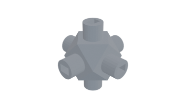
Cube Node
Have fun building structures by joining nodes with chopsticks
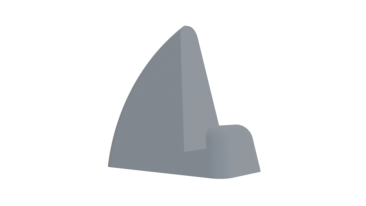
Laptop Stand
Use 2 to hold a thin laptop upright. Great with a wireless keyboard
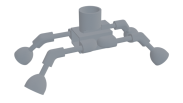
Little Buggy
A toy for kids. Requires 9V battery, small gray motor, and bouncy balls for feet
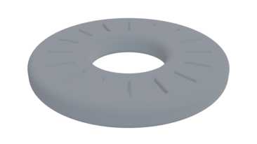
MicroSD Card Ring
Holds 16 MicroSD cards. Doubles as a paper weight